The objective of the project was to redesign the existing website and ensure the company message was communicated.
Problems
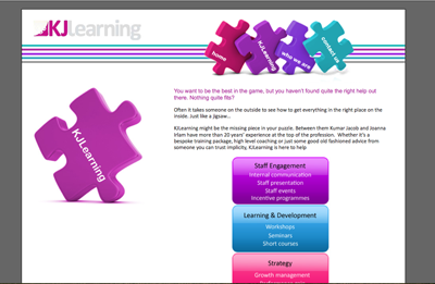
As epitomised by this particular page, the original design detracted the visitor from the central message -
what does the company do, what services does it provide.
Specific problems with the design include:
The dark grey background keeps drawing the eye away from the other page elements;
There are too many images for the eyes and brain to take in any of the messages or correctly interpret the visual clues. For example,
the purple text appears to be a link. Its meant to be a highlighter but does not succeed in filling that role.
The colours are too varied to form a cohesive unit.
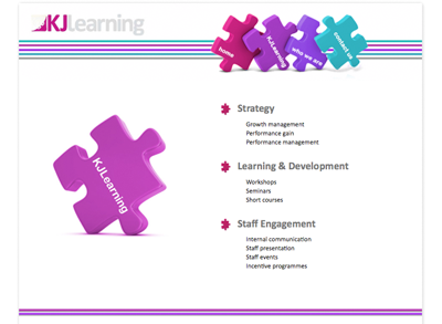
Solutions
By changing the background to white and giving the content a light grey rounded
border with a subtle drop shadow, the design immediately looks current. The drop shadow gives the content
a little pop without being too obvious. These effects were achieved using the CSS3 properties border-radius and
box-shadow.
Removing the coloured boxes housing the areas of expertise that KJLearning
possess provided multiple benefits. The extra white space served to draw more attention to the words.
Additionally, because the wording was part of the diagram image, these words
would not be read by search engine bots and the site lost out on a few search engine ranking points. Admittedly
minor, but still a consideration.
Adding in a miniature jigsaw image to act as a bullet point unifies the design
and directs the eye down the areas of expertise list. Immediately, the message is communicated and the visitor is not
searching for information.
Finally, I moved the introductory text to the home page where it belonged and ensured the site
colours were kept to those used in the logo. Visit KJLearning's website to view
the new design on all the pages.